Our infographics help illustrate and quantify complex concepts, on a global or regional scale. Through accurate data visualization and in-depth descriptions, often developed in partnership with relevant NGOs in the field, these maps integrate our yearly analysis of the World’s status. For this reason, they are used in divulgative and educational activities by teachers of every level, journalists, but also by humanitarian organizations in their training.
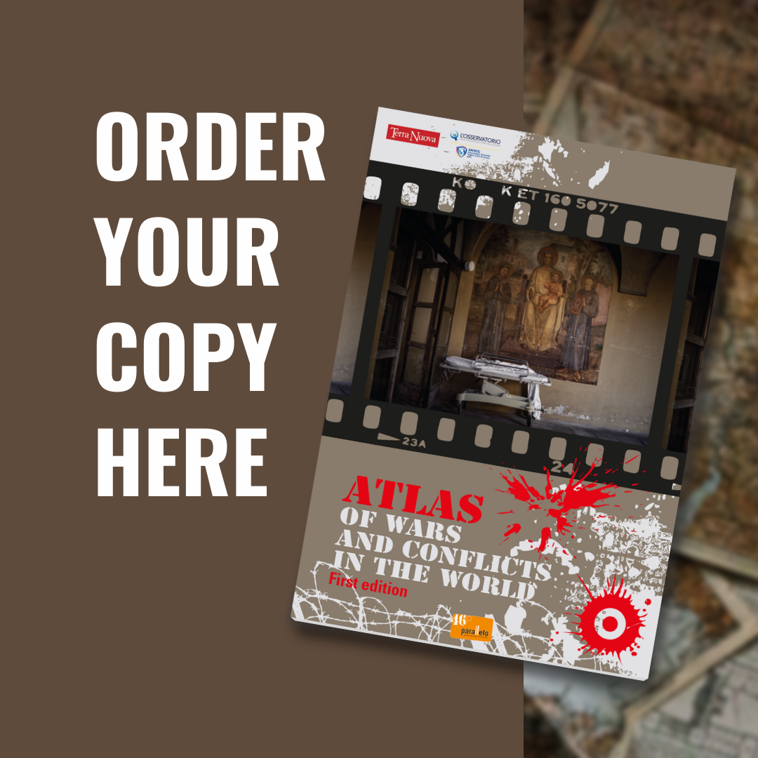
These infographics firstly appeared in the IX edition of the Atlas Of Wars and Conflicts in the World, published in 2019 and updated in 2020 with a Coronavirus Special. You can find and read the new infographics, with new topics and data from 2021, in the X Edition of the Atlas of Wars, available soon. Subscribe to our mailing list to be notified when it’s out!


